PVS News
More Than Signs: Introducing Pride Visual Solutions
For 40 years, Pride Signs has been known as a signage company. But signs were never the whole story.
When Kris Aubé, Pride’s Director of Business Development, Sales & Client Success, sat in a project meeting where Pride had been named the exclusive vendor for a building’s ACM (aluminum composite material) cladding, the architect and general contractor were puzzled.
“Why are we using a sign company for cladding?”
The question stuck with Kris. Pride had been fabricating and installing ACM cladding since 2014. The capability was already there. The company’s name just didn’t show it.
Since its founding in 1986, Pride’s work expanded well beyond traditional signage. The company was fabricating metal paneling that wrapped building exteriors, canopies and structures that framed entrances, signage that guided visitors inside, and digital screens and video walls that brought spaces to life.
The work had evolved. The name hadn’t.
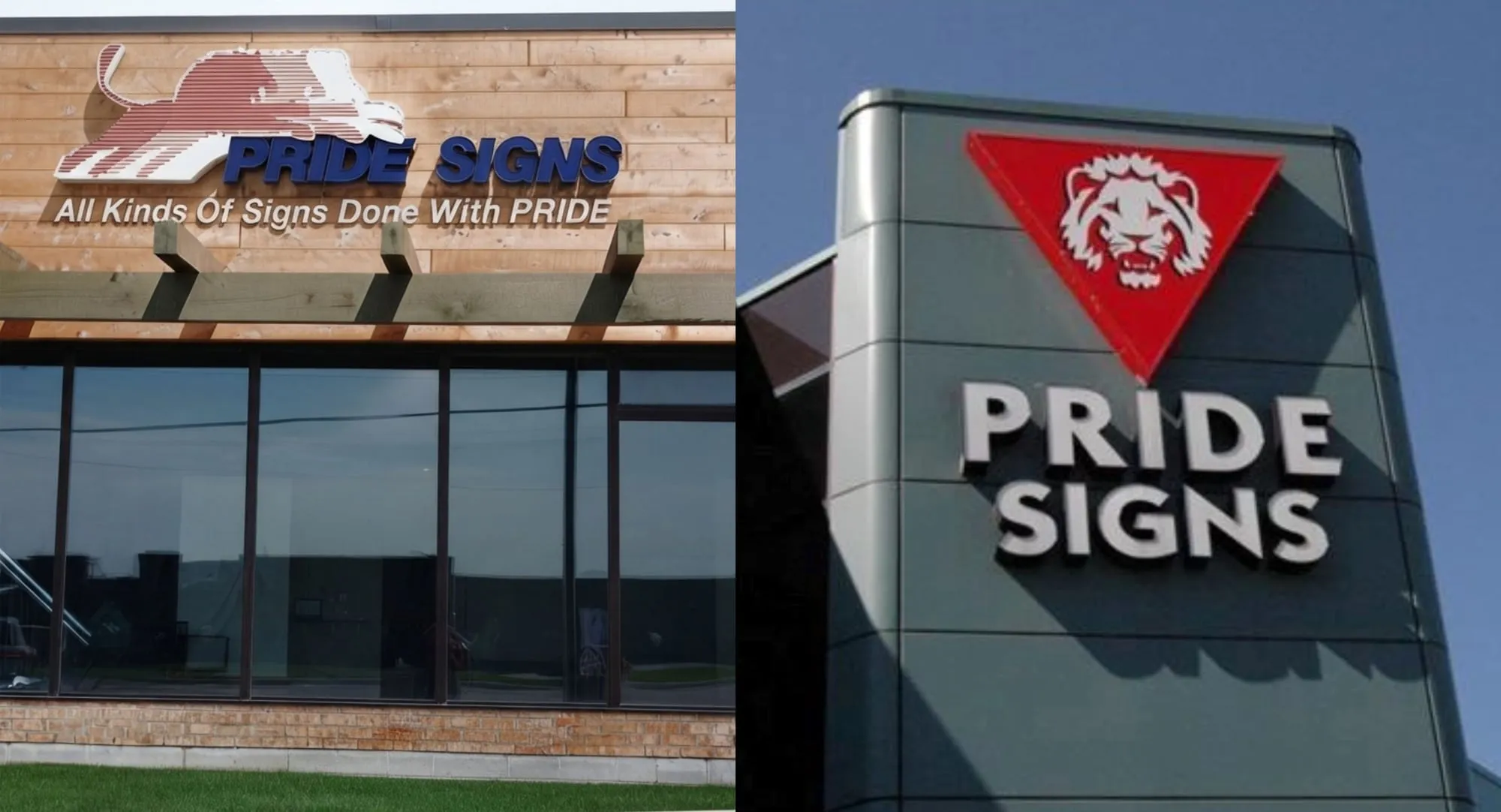
That gap became increasingly difficult to ignore. “Pride Signs” suggested a company focused on signs, while the work Pride was delivering encompassed much more: helping clients create cohesive visual environments across their buildings and spaces.
As Kris explains, “The name Pride Signs can make it seem like we’re selling a commodity, transactional product. What we’re really moving toward is consultative sales, where we’re a trusted advisor and a partner to our customers. Instead of just selling signs, we’re helping them with their exterior branding.”
The disconnect between the company name and its breadth of offering prompted the decision to undergo a rebranding to Pride Visual Solutions.
The new name brings the full scope of Pride’s work into focus. Signage, cladding, structures and digital are not separate capabilities. Together, they give clients one partner across more of their visual environment.
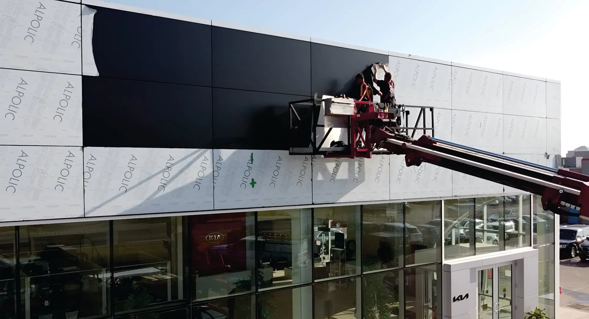
As Kris puts it, “It’s big, but it’s not, because it’s nothing we haven’t been doing in the past. We’ve been doing it for a while. We’re just going to do more of it.”
While the name is evolving, the foundation Pride has built over four decades remains unchanged. Its relationships, expertise and experience continue to shape the company today.
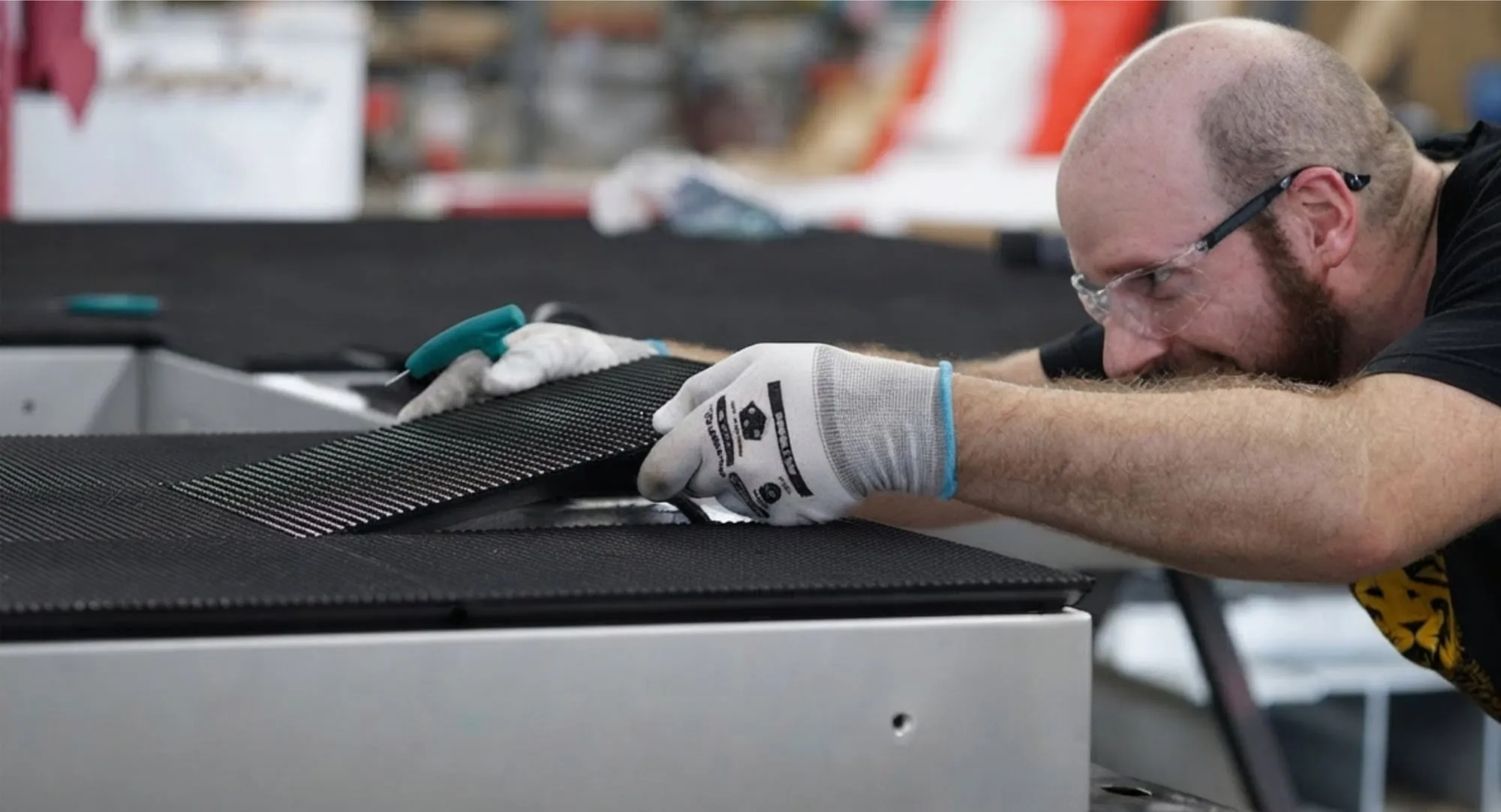
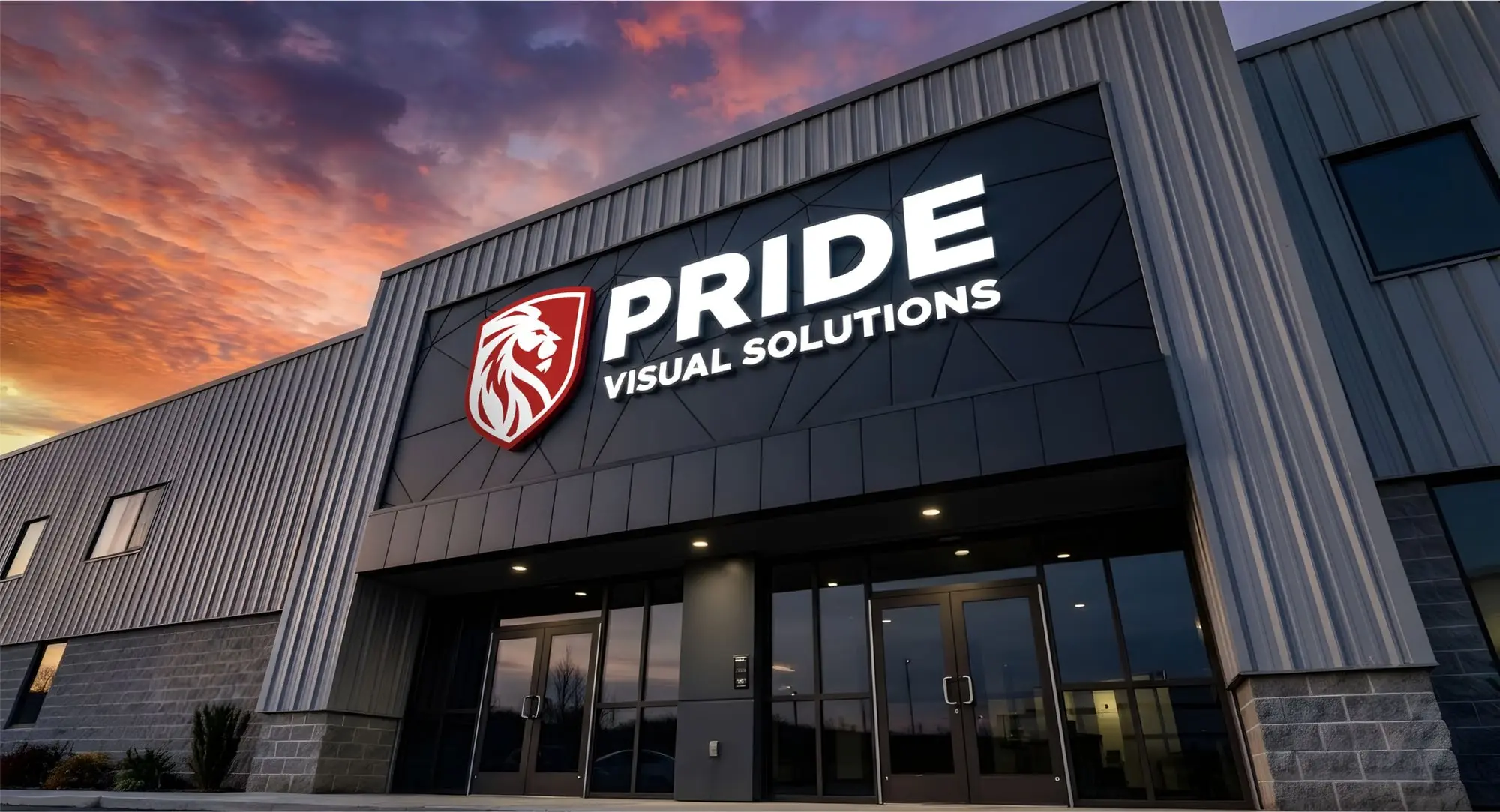
The refreshed logo reflects that same evolution. The lion that has represented Pride for four decades remains, now set within a shield with its gaze turned toward the future. It reflects the balance at the heart of the rebrand: Pride Visual Solutions is not a departure from what Pride has built, but a clearer expression of it.
For decades, Pride’s work spoke for itself. Now the name does too.